

Maps
I've been thinking about this problem for a while but, as usual, Louie Mantia Jr's post about Maps possibly becoming a useful app one day was an inspiration to get writing*.
Now, he sarcastically, or hopefully (or both), posted that "one day search in Maps will be useful". He gave the example of a search for "lunch", presumably to find some nearby cafés and restaurants, turning up a result called Lunch Lake in Canada (he lives in Japan) which could not be less useful if it tried.
I have a similar gripe. I use Apple Maps a lot when I'm planning my many trips to Japan. I've been twice already (once in 2024, once in 2025). I have another trip coming up for school (10 days of babysitting, yay) and another personal holiday for most of December 2025 and January 2026. I've been using Apple Maps a lot.
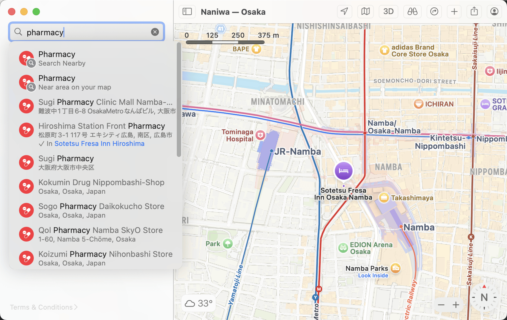
But every time I use it, I'll try to perform a search for, say, pharmacies near the hotel that I'm actively looking at on my map, press Return, and be transported to the nearest pharmacy to my current location (which is in New Zealand, or about 9,300 kilometres away. That's because the default search (as per the screenshot below( is "Search Nearby" rather than "Near area on your map". For Louie, it seems to have taken neither option into account and dove head first into stupidity; luckly for me, it's merely a minor inconvenience.
However, that brings me to something I consider a much larger regression. It's the design of the app in macOS 26 and 27, specifically its Liquid Glass interface. I use "Liquid Glass" here in the sense of the design language rather than just the transparency. That's the choices made for things like toolbars, sidebars, etc., including when and how they should be used.
My gripe is about trying to search public transport routes. Here's the tl;dr video for those of you who want a visual demonstration. The tl;dw is below:
Here are the workflows in macOS 15 and macOS 27 (though it's the same in 26) side-by-side.
| Step | macOS 15 | macOS 27 |
|---|---|---|
| 1. | Click on the Directions button on the toolbar | Use the main search bar to find a place, removing any existing search and cluttering your search history†. |
| 2. | Switch the directions type from driving to public transport | Wait until the location details panel loads, then click the Plan button‡. |
| 3. | Type in and then select the origin and destination in the two text fields. | Switch the directions type from driving to public transport. Watch the pre-selected destination suddenly disappear and the app get stuck loading routes from nowhere to nowhere. |
| 4. | Click on the Plan§ segmented control. | Click on the only remaining text field, then type and select a location into the next panel that comes up. |
| 5. | Click on the date picker and choose the following day's date. | Rearrange the origin and destination if needed (likely) or click on the destination and repeat step 4. |
| 6. | Click on the time picker's two sections for hours, type '10', press Tab, then type '00'. | Click on the Options button, which is easy-to-miss due to a bizarrely small font size. |
| 7. | Inspect one or more routes by clicking on the disclosure arrows next to each result. | Wait for the next panel to slide in, then click Leave At. |
| 8. | Done! | Choose the following day's date. |
| 9. | Click on the time picker twice; once to select the picker, then again to select the hour. Try typing in '10' but get halted when the app accepts '1' and then makes the hour picker lose focus. | |
| 10. | Repeat step 9, but type both '1' and '0' which will work this time for some reason. | |
| 11 | Click on the blue tick at the top of this panel, which will slide out. 50/50 chance if the next panel will react and show the updated results straight away or hang for a second. | |
| 12 | Click on the ⒤ button to view one result at a time. After you're done with each result, click the Back arrow to return to the list of results. | |
| 13 | Done. Right on the luckiest number. |
† You can actually press Cmd-R to show the Directions panel but you'd have to hunt through the View menu to know that; there's nothing on the Maps window itself.
‡ The word Plan contrast switch with the word Directions used in the View menu.
§ See?
The newer version of the Maps app is such a mess when trying to do basic things. It makes finding the Directions panel harder, it makes sorting the origin and destination harder, it makes fiddling fine details with regards to dates and times harder, and it makes comparing route options harder. It is, in a word, harder.
Less liquid, more ice. Less glass, more ass.
I had such high hopes for macOS 27, the so-called "Snow Leopard" to macOS 26's "Leopard". The difference is that whilst Leopard certainly was a heavier beast than Tiger, and Snow Leopard certainly ran a lot better on the same (Intel) hardware, macOS 27's fixes seem much less obvious to me when the general philosophy of the operating system, and Apple's new design system in general, seems inadvertently to be to get in the way as much as possible.
The older version of the app isn't necessarily great by any means but it had all the buttons I need in the places I expected them to be. It did everything right the first time. When Liquid Glass became a thing, it even further cemented into Apple something that they had long been resisting (less and less over time, mind you): to simply put iOS apps on the Mac and call it a day.
Mind you, we'd already been suffering with UIKit for Mac apps like Home which has never felt like a first class citizen on the Mac. Or Weather. I don't know about News, we don't have that one in New Zealand. Not that I think the sidebar pop-over-laden monstrosity that is the current Maps app fares any better on iPhones and iPads, but at least they get the spinners for the date and time rather than broken keyboard entry.
Apple can fix the keyboard issue. However, they famously don't renege on their design changes. Maps won't go back to using pop-overs, it won't discard the over-reliance on modal sidebar panels, it won't have a toolbar with all the options you could want front and centre.
One day directions in Maps will be useful.
One day directions in Maps will be useful.
One day directions in Maps will be useful.
One day directions in Maps will be useful.
One day directions in Maps will be useful.
One day directions in Maps will be useful.
Postscript
I started following Louie, a graphic designer (ex-Apple) who makes some of my favourite playing cards, last year when some of his epic rants about Liquid Glass and macOS 26. He himself said that he didn't want to put so much focus of his writing and social media engagement on them but, as a designer who cares about his craft, I suspect he couldn't help himself.
Since then, I've been inspired by his personal site and blog. His is filled with his amazing and detailed design work, musings on things that interest me, and this and that. Mine, by contrast, is just feet pics and poorly-written descriptions of those pictures.
One thing he said was that making a website could be as simple as "[writing] some HTML and drag[ging] that to a server on FTP". Seeing that, I realised my previous efforts at making a website using a CMS (one called Grav) were over-engineered. I've since rewritten the site a couple of times in HTML and CSS, with only a spoonful of JavaScript.
I don't claim it to be any great design, nor a work of art, but it is my design and it is mine and it belongs to me. Hem hem.
So when I say he inspired this post, I mean that I wouldn't have bothered to write anything if I hadn't started reading his Mastodon posts, catching up on his blog, and following his advice.